Description
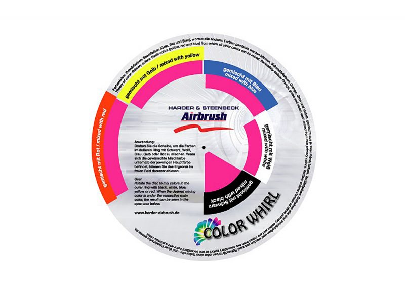
THE COLOR WHIRL:
The primary colors of red, yellow and blue are illustrated in this Color Wheel, surrounded by the secondary colors of orange, green and violet mixed from these, and supplemented in each case by an intermediate stage (yellow-orange, yellow-green, blue-green, blue-violet, red-violet and red-orange).
USE:
Should you wish to mix the main colors (outer ring) with black, white, blue, yellow or red, simply turn the overlying disc until the desired mixing color is below the respective main color. You can then see the result in the open box under the mixing color.
THEORY OF COLOR:
The primary colors of yellow, red and blue form the basic modules of the theory of color, as all other colors are created by mixing these. The secondary colors of orange, green and violet are obtained by 1:1 mixing of two primary colors in each case. Mixing secondary colors with their neighbouring primary colors creates six intermediate stages. On the other hand, mixing two secondary colors together creates a tertiary color. Whereas secondary colors consist of two primary colors in each case, tertiary colors are a mixture of all three primary colors. Tertiary colors encompass the large spectrum of brown and olive hues, as complementary color components are always involved. With regard to tertiary colors, a total of approximately 100,000 distinguishable mixtures can be achieved, whereas “only” about 160 can be created in the case of the secondary colors.
Complementary Colors:
Colors lying opposite each other on the Color Wheel are known as complementary colors. The colors stand in contrast to each other in each case, with the starkest contrast occurring where colors are positioned exactly opposite each other. Complementary colors contribute mutually to each other’s strength and radiance. According to the Goethe / Itten model, the following combinations are regarded as complementary and are used for artistic purposes: blue ↔ orange, red ↔ green and yellow ↔ violet. When mixed together, these colors neutralise each other or create broken grey hues. Those colors which create a (neutral) grey hue when mixed with the original color are termed complementary, both where an additive color mixture and a subtractive color mixture are involved. A complementary color supplements another color to form white (in the case of light colors and RGB colors) or black (in the case of body colors and CMY colors).
CONTRASTS:
• Cold-warm contrast: The warm colors are red, orange and yellow, while grey, blue and violet are termed cold colors. The colors trigger different emotions in the observer, e.g. closeness (warm colors) and distance (cold colors).
• Light-dark contrast: This refers to the contrast created by the differing brightness of two colors. Light-dark contrast strives to achieve a balance in visual perception.
• Contrast of hue: This contrast occurs as soon as a minimum of two pure colors are used. Mixing with other colors weakens the contrast of hue. The contrast of hue is strongest where the triad of pure colors yellow, red and blue is utilised.
• Quality contrast: The contrast between saturated and bright colors and dull, sombre and broken colors.
EFFECTS:
Modulations are extremely important for artists, as any desired color can be mixed if a primary or secondary color is taken and a suitable quantity of black and/or white added. For example, the colder or paler a color is, the farther away it appears, while the warmer and stronger it is, the nearer it appears to be.
COLOR MODULATIONS:
Combinations of several colors which, given equivalent brightness and color quality, are in a defined relationship to each other. color modulations are harmonious, yet contrast richly. Where the Color Wheel is correctly aligned, color modulations which are regarded as pleasant can be found through simple geometric relationships. colors at an equivalent distance relative to each other can form triads in the shape of equilateral triangles.
HARMONY:
Harald Küppers describes a harmonious color composition as “the visual appearance that moves us aesthetically”. This means that harmonious color compositions are pleasing to the observer, whereas a hard-edge contrast (overlying complementary colors) taxes the human eye too greatly and is experienced as unpleasant.


Reviews
There are no reviews yet.